Design Project Templates Feature
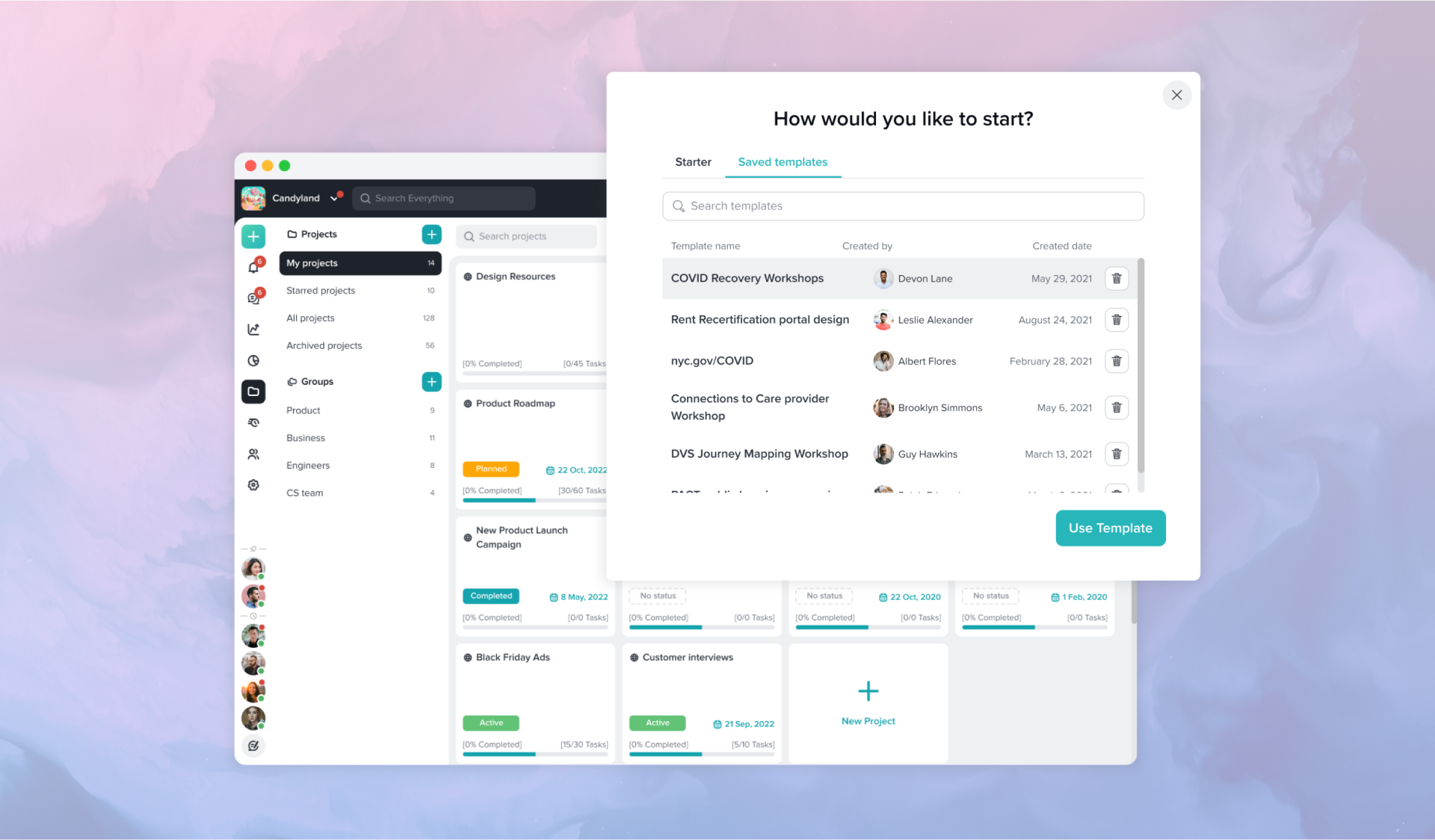

Taskworld is a cloud-based collaboration platform designed to facilitate project and task management. It allows teams to assign, monitor progression, and measure performance.
The template feature has been one of the top 20 requests in Taskworld. Since this was such a highly requested feature, I was assigned this project to gain a better understanding of our user's needs. I worked in collaboration with the Product Manager to refine the core problems and propose a solution.
I analyzed through all of the support tickets mentioning the request for a project template.
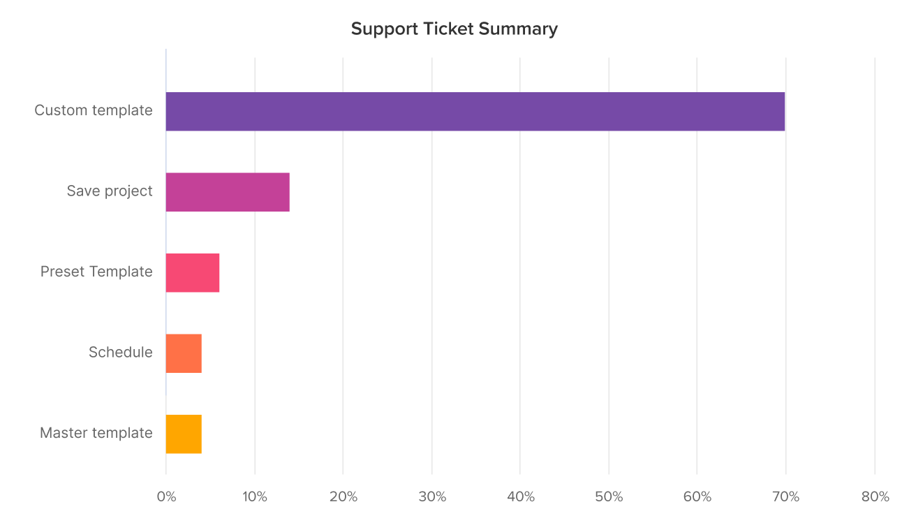
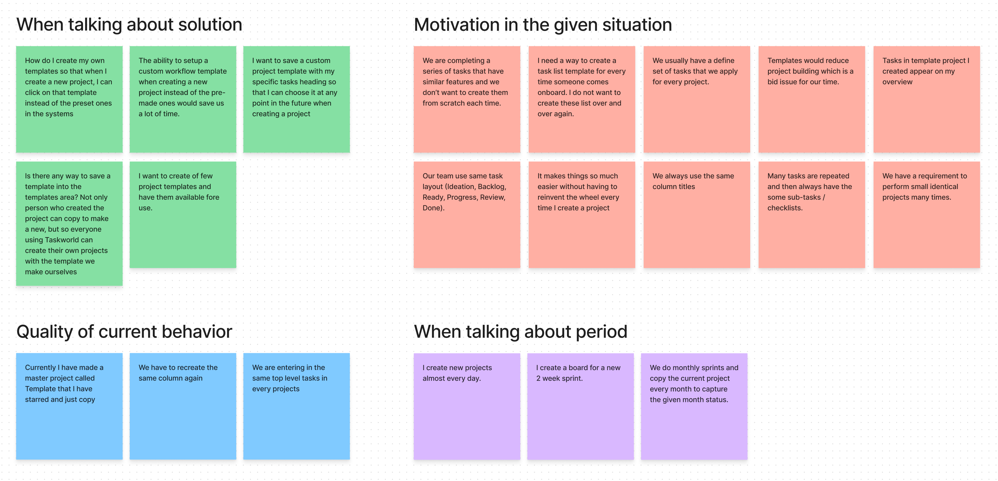
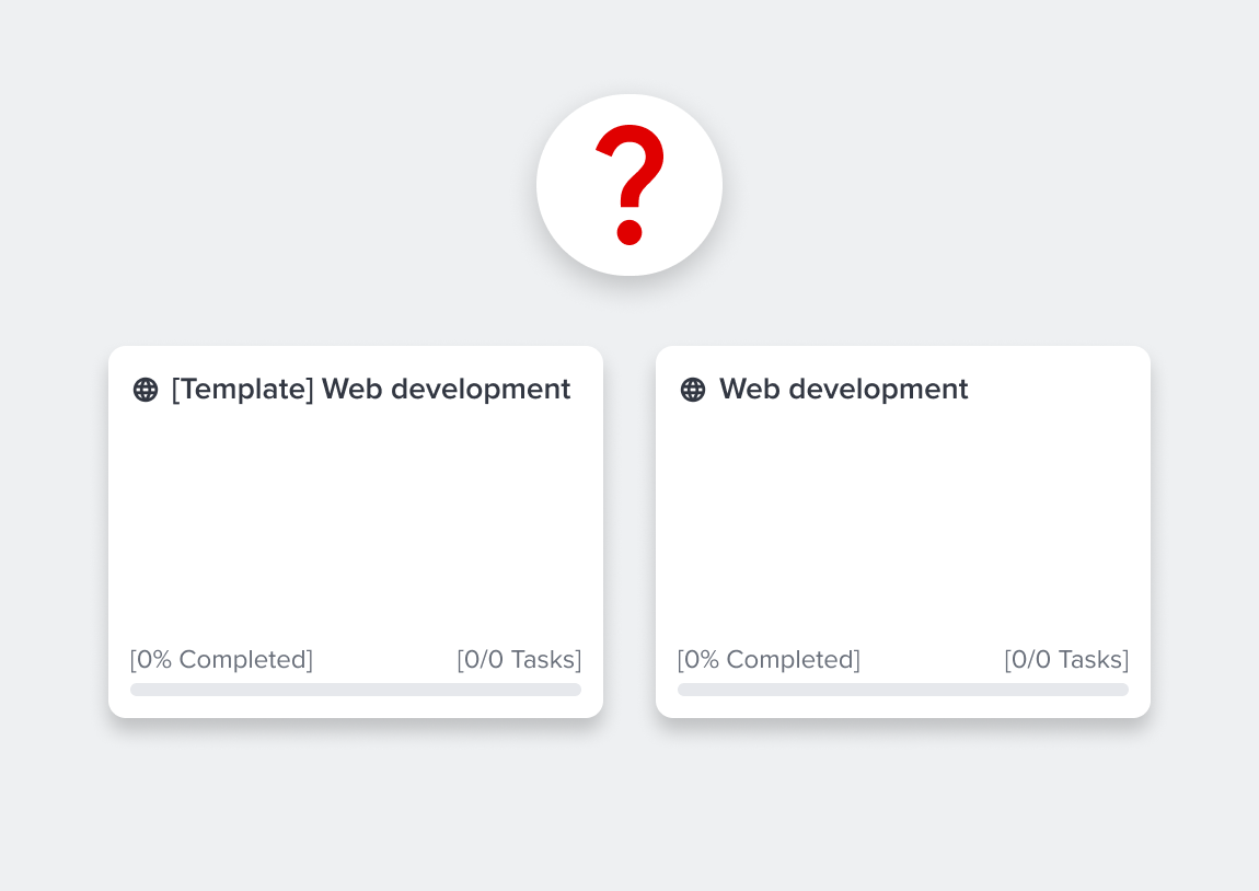
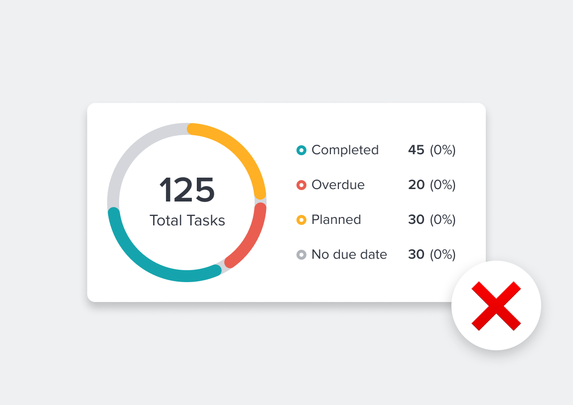
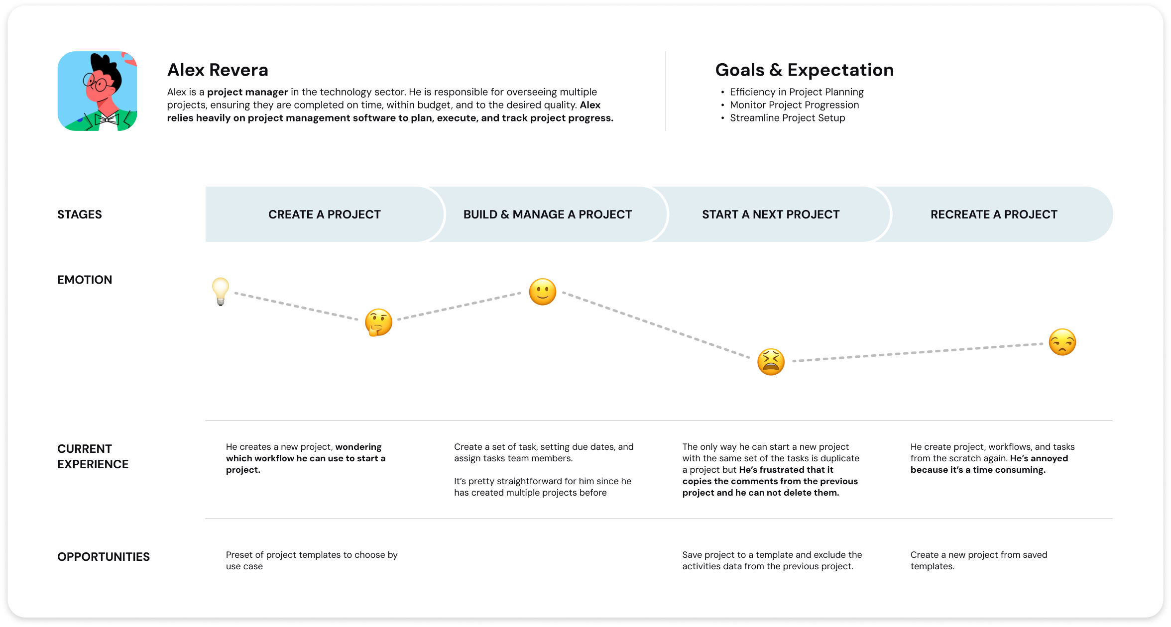
After synthesizing the data via affinity mapping, we could see a similar theme of the issues users had with the project creation process. Most of the users needed the ability to create their own workflow as a template.
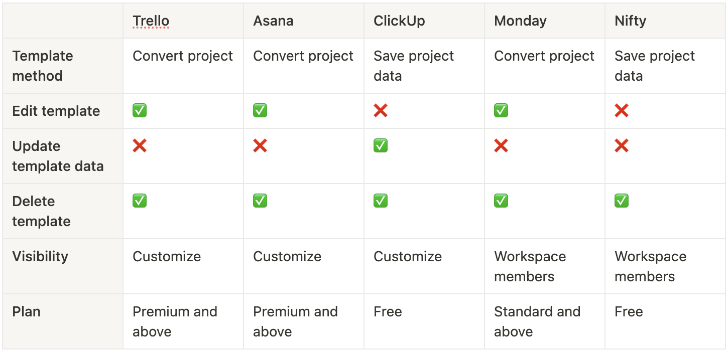
I chose and compared the major competitors that have similar services and business models to Taskworld, aiming to find out what aspect we should consider for the template feature.
We have been through several iterations for the template feature in terms of design, solution, and feasibility for the MVP. Due to a limited time frame and technical resources, we decided to go with a solution to save an existing project as a template and have a list of templates available for users when creating new projects.
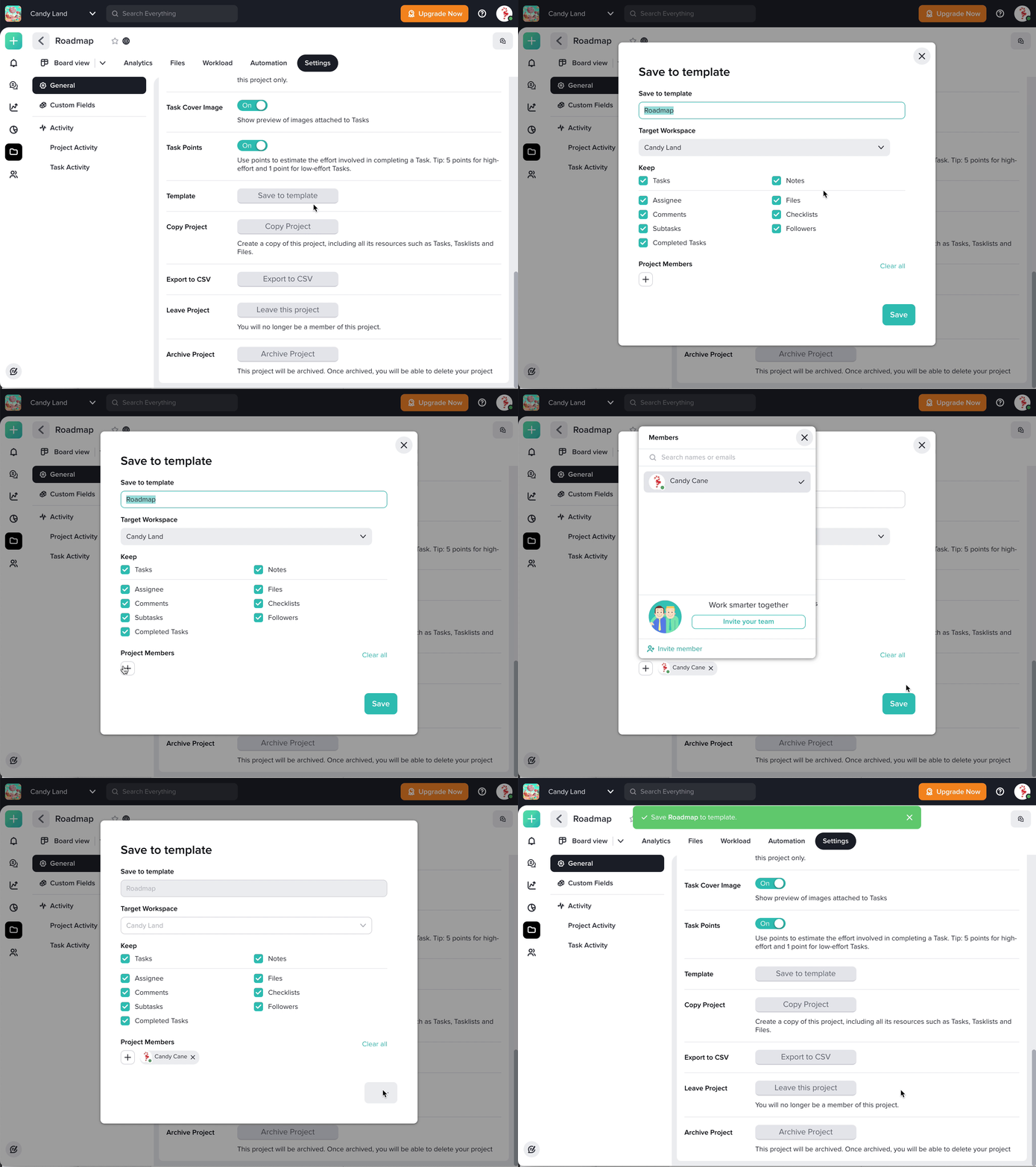
The option to save a project to a template in the project settings.
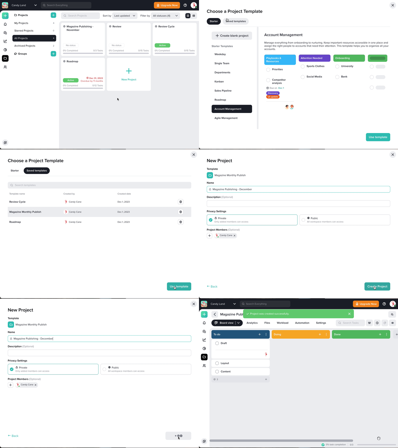
When users click on the new project button, they can choose a template they have created.
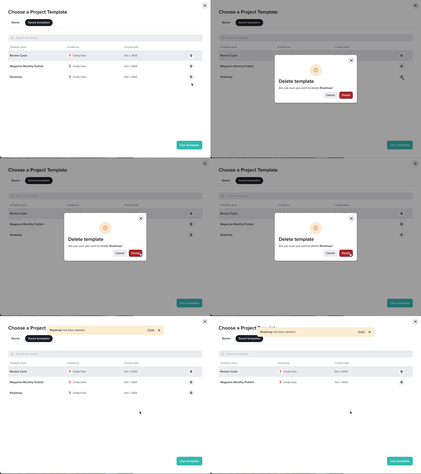
Users can manage their templates, including the ability to delete previously created templates.
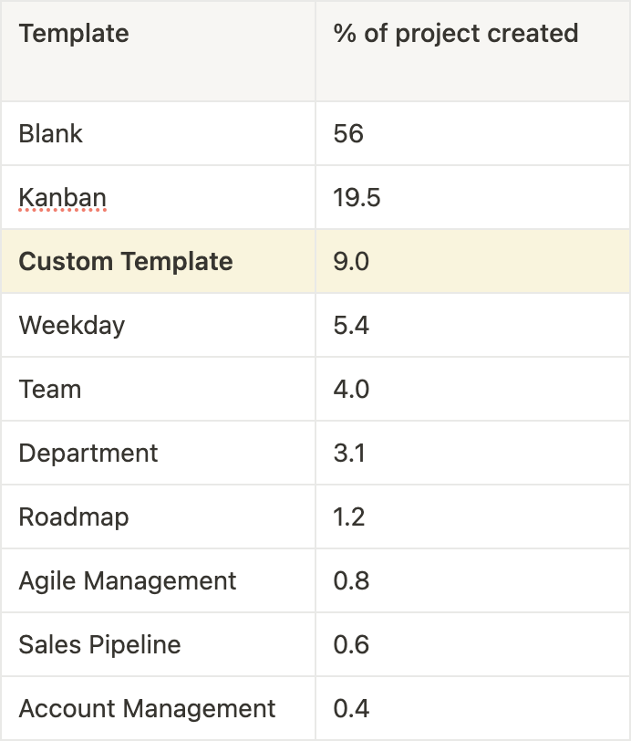
“Custom Template be come the 2nd top template users use to create a project by 20%”
After we launched this feature we check the usage data of custom templates compared with the starter templates Taskworld provided to users.
According to the data, Kanban template has the most usage because it is the most common template users use to start a project.
1. Understanding User Feedback
User feedback is a vital component of the design process. However, it's not just about blindly implementing every piece of feedback. It requires a deep understanding of users' needs, motivations, and pain points.
When we first introduced the copy project feature, it did not align with the users’ expectations. After conducting user research we were able to further refine the feature to address the user's core concerns.
2. Collaboration with Engineer
Collaborating with an engineering team is challenging, primarily related to time constraints and technical limitations. To address these challenges, I have learned these key insights.
I am delighted that my design has had a positive impact on addressing our user pain points and enhancing their overall experience according to the metrics.