Improved Analytics Feature
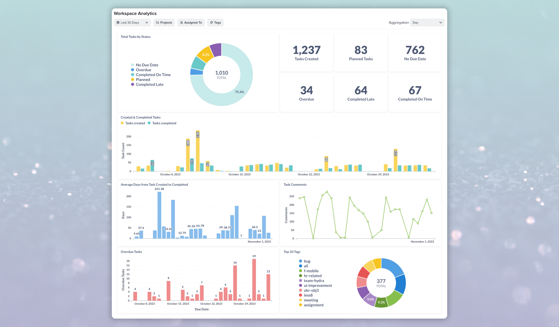

Taskworld is a cloud-based collaboration platform designed to facilitate project and task management. It allows teams to assign, monitor progress, and measure performance.
The Challenge: Analytics has been underutilized due to a critical gap in the way users can view statistics across all projects. Users are forced to navigate through individual project data, which is cumbersome and time-consuming, and it hinders their ability to gain a holistic perspective on their data.
Objective: Revamp the Analytics feature to make it more user-friendly, intuitive, and engaging. The new design should offer users the ability to see statistics for all projects at once, encouraging more frequent and meaningful interactions with our analytics tool.
In order to better understand our customers needs regarding analytics, we had arranged interviews with our customers across a broad range of usage scenarios. In total we had interviewed four customers to gather more insights on their needs.
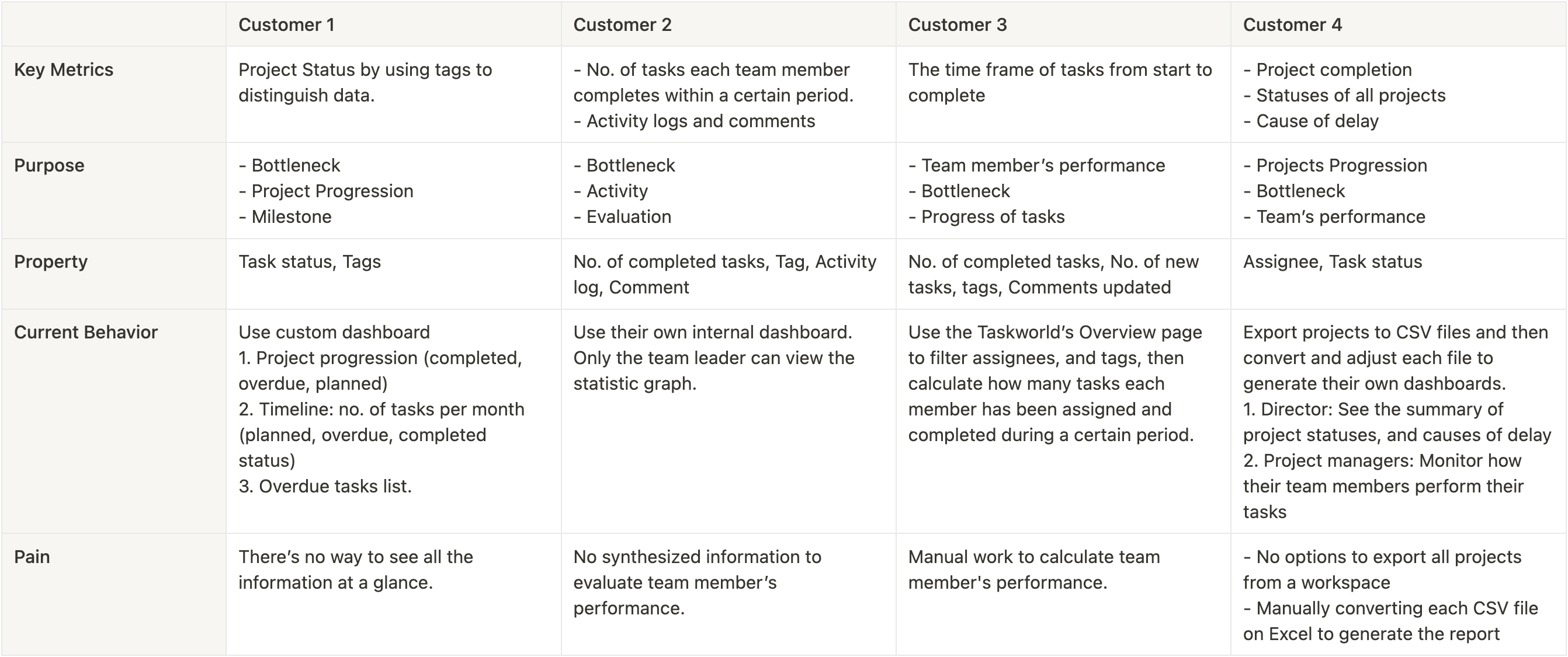
Analyzing projects in Taskworld is currently a hassle. Seeing everything at once is difficult, so users have to pull data out manually to create reports. This time-consuming process slows them down and makes it hard to get a clear picture of how their projects are doing.
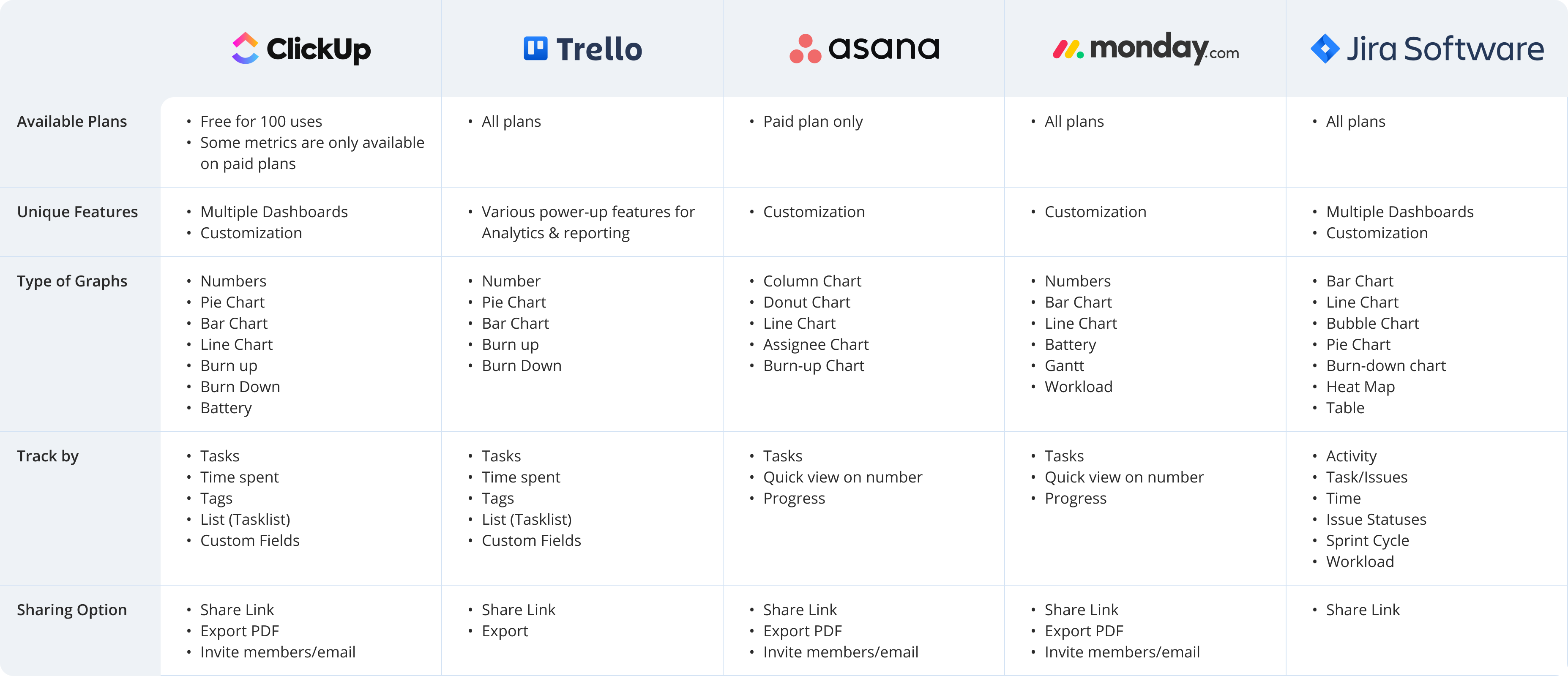
We went through several iterations of the new analytics feature in collaboration with the Data Team before settling with the final data visualizations that can help our customers solve thier data needs.
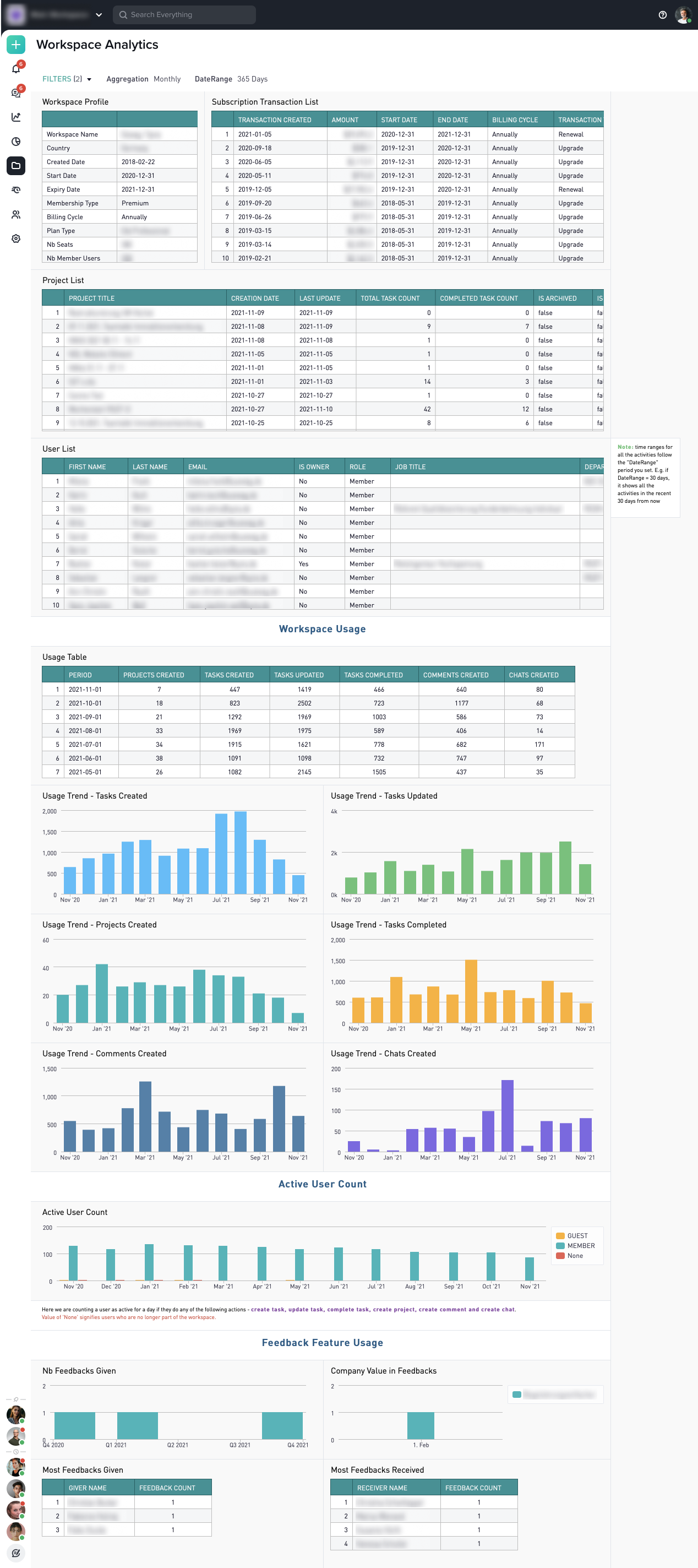
The old analytics page showcases the status of a workspace, billing transactions, project lists, and the list of users in the workspace. However, this information is redundant as it can be found on the people, billing, and projects pages. This dashboard does not provide valuable insights into performance or bottlenecks, as desired.
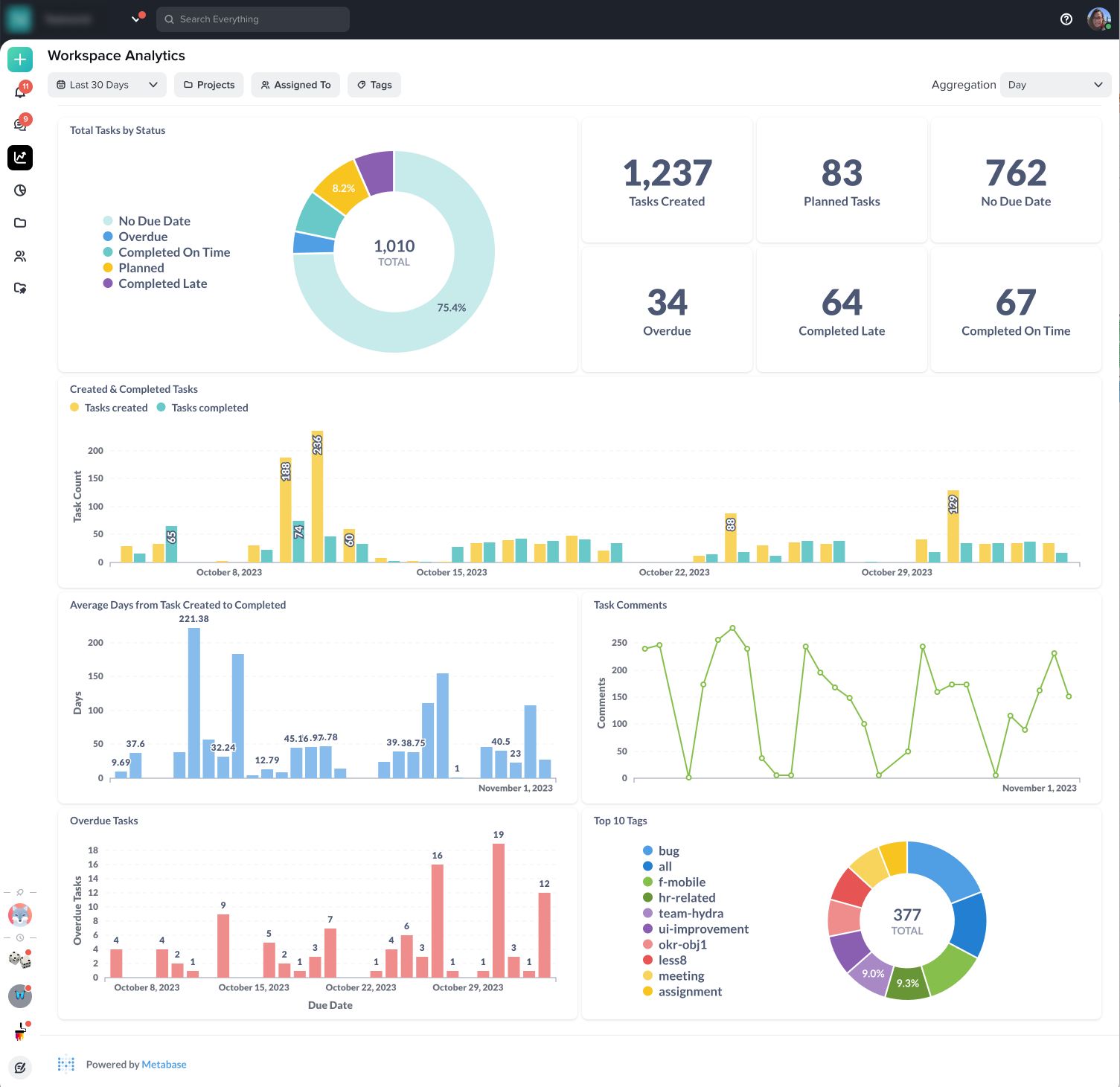
The new analytics feature includes graphs that allow users to track data based on their preferred filter criteria, such as Period, Projects, Assigned to, and Tags. Managers can now easily monitor the number of tasks assigned to team members, along with the average time taken from task created to completion.
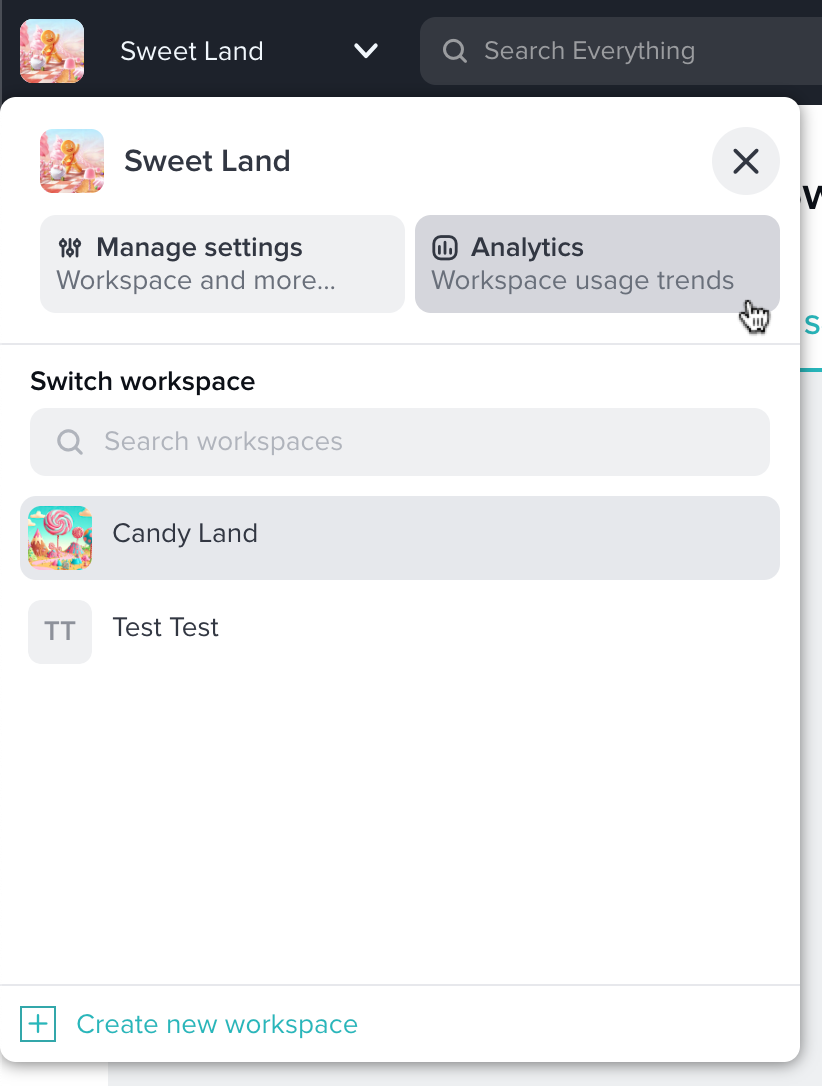
The analytics access was hidden in the workspace setting and was only available to the workspace admins.
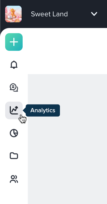
Added analytics to the left navigation menu. All members can now access the feature.
We measured the overall usage by tracking the average page views of the analytics page and compared with the old version.
This end-to-end project leadership has been a learning experience in deepening my understanding of the design process. One of the lessons I got from this project is the importance of a user-centric approach to design. tool.
Our discovery that the previous analytics feature had low usage was a result of its failure to meet the users' needs. By conducting in-depth interviews and gathering user insights, we identified pain points and unmet requirements that allowed us to create a more engaging analytics