Back

Improve S&P Online Delivery

Role
UX/UI Designer
Company
Senna Labs
Timeline
2018
Platform
Web & Mobile
Overview

S&P Delivery is an e-commerce website that focuses on encouraging customers to order food, drinks, desserts, and bakeries that deliver quality taste.

Problem
Many of the client's customers prefer to order food delivery through the call center, neglecting the website and mobile app. The project aimed to increase online food ordering by improving the website and mobile app user experience.
Outcome
The client was satisfied with the improvement of the new application and has chosen to continue using our service.
Role
I worked closely with the Lead Designer as a UX/UI Designer, handling Thai translation and creating graphics. I also researched competitors, interviewed users directly, and conducted usability tests. These findings helped me design user interfaces for mobile platforms.
Key Skills
  • User Research
  • User Interview
  • Skecth
  • Invision
Research
Competitor Analysis

I researched various competitors to understand how their online food delivery flows worked.
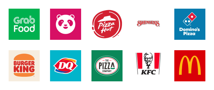
Key Findings
  • Ability to select the delivery location on a map and automatically fill in the address based on the selection.
  • Simple sign-up flows. Most competitors need a name, email, phone number and password.
  • Seamless sign-up to checkout flow. Once users sign up, they can continue the checkout process with the items they have already selected in their cart.
User Interviews

I performed a total of six 1-on-1 interviews with users to better understand their behaviour regarding online food delivery. During these interviews, I conducted usability tests with the current S&P delivery flow using a tool called Lookback.
Key Insights
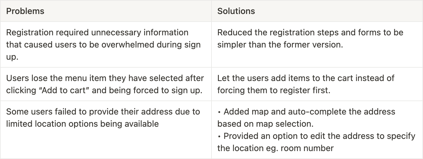
  • 5 out of 6 users found it difficult to find the menu items they were looking for.
  • 4 out of 6 users did not like when they were forced to register after clicking “Add to cart”.
  • 4 out of 6 users complained that the registration process was overwhelming with too much unnecessary information required.
  • 3 out of 6 people had trouble when trying to add their address. This was due to their location not being available in the list of location options.
Summary
Design
Mobile UI

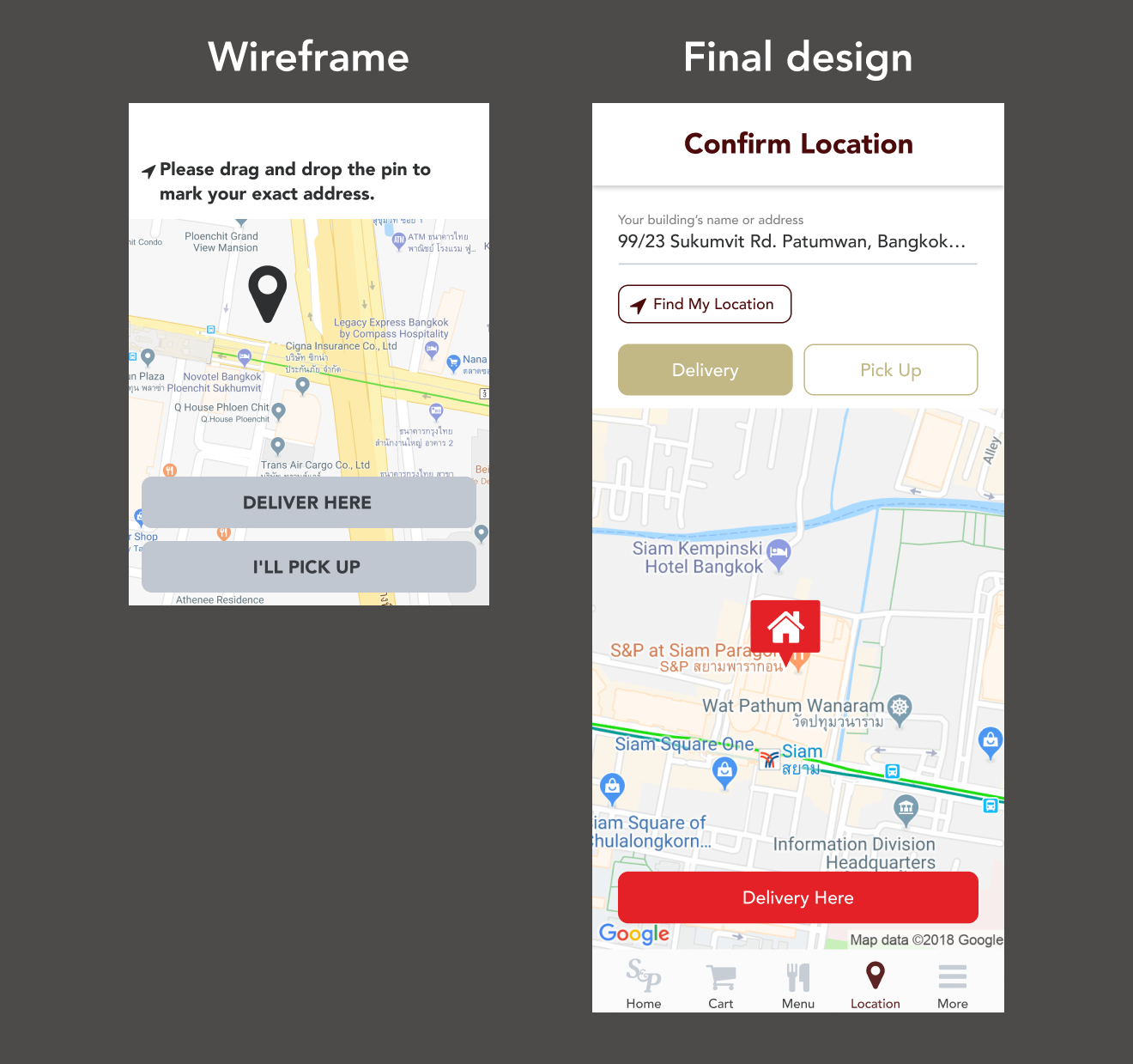
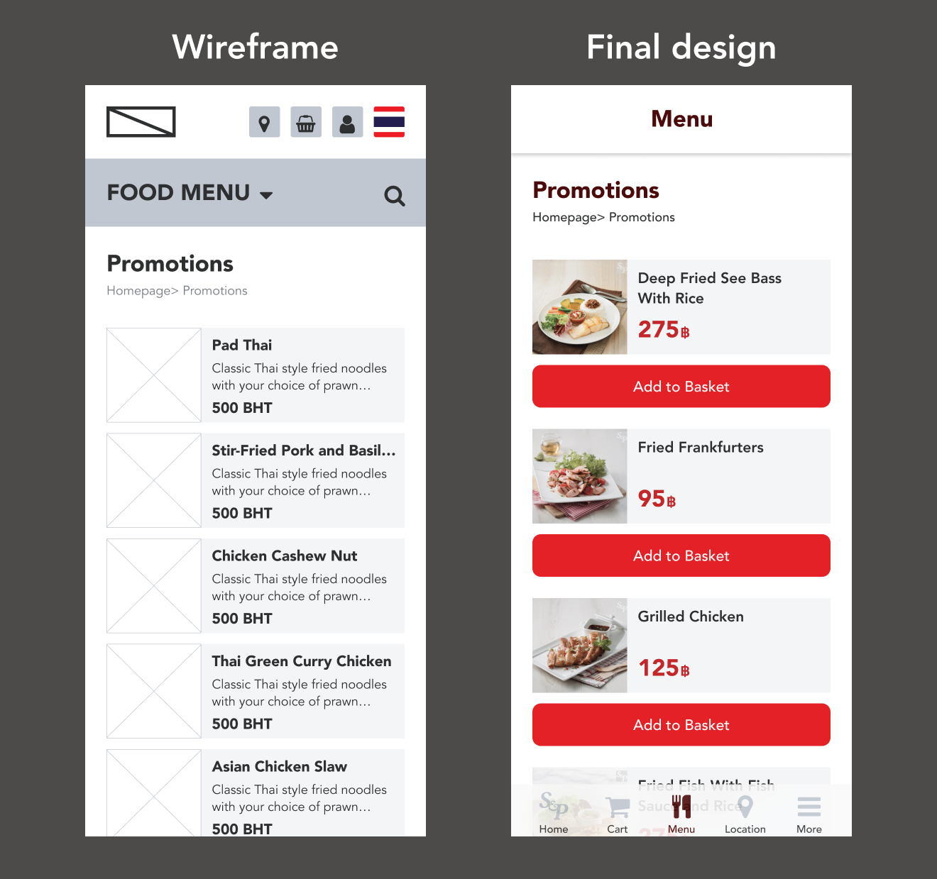
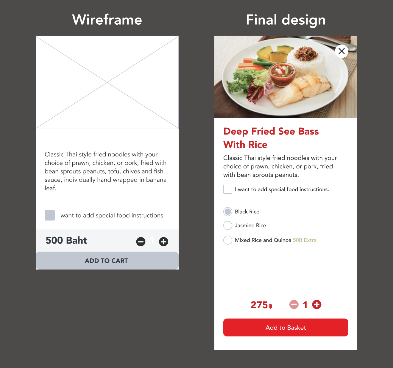
I was assigned the task of designing the UI for the mobile version of the delivery flow. It was important to ensure that the design was consistent with the desktop version.
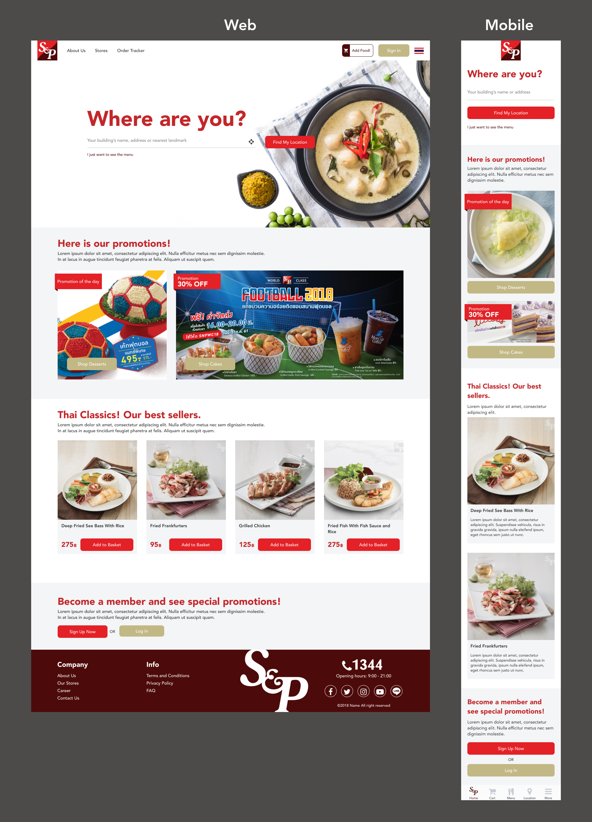
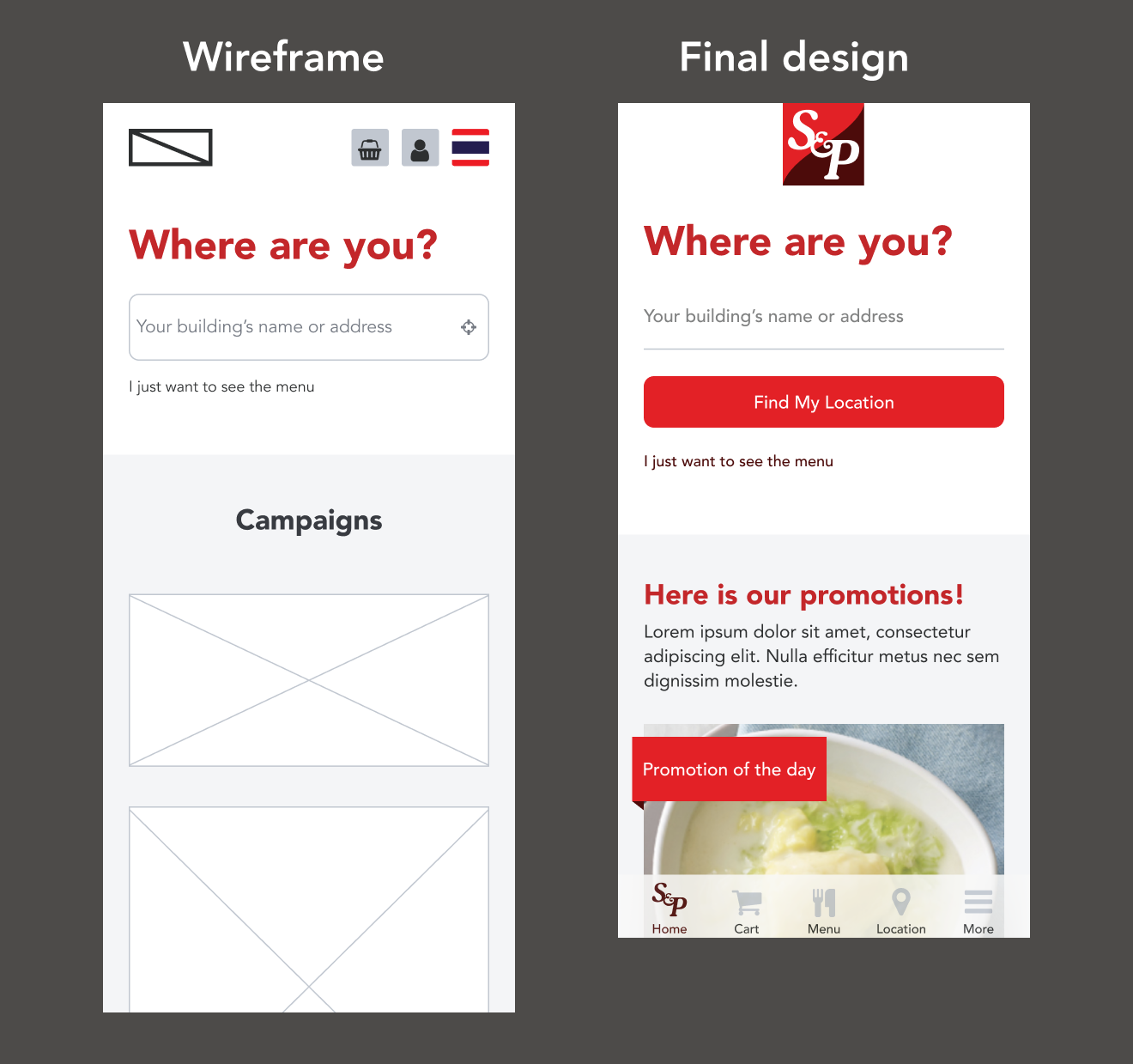
Mobile UI (selected screens)

Homepage

Map

Menu

Product details

Mobile Prototype
Conclusions & Learnings

1. User research

Conducting user interviews and usability testing guided our design decisions. I learned to observe user behaviours to get a better understanding of their preferences, needs, and pain points.

2. Grid system

Learning about the grid system enabled me to organize content, create alignment, and maintain visual hierarchy for a better user experience.

3. Design System

Crafting UI within the design system guidelines ensured consistency in typography, color, and UI components across platforms.